Your Digital Menu Shouldn't Look Like Everyone Else's
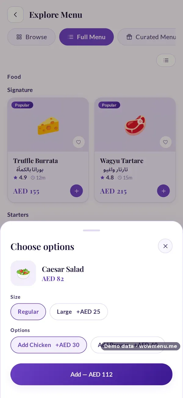
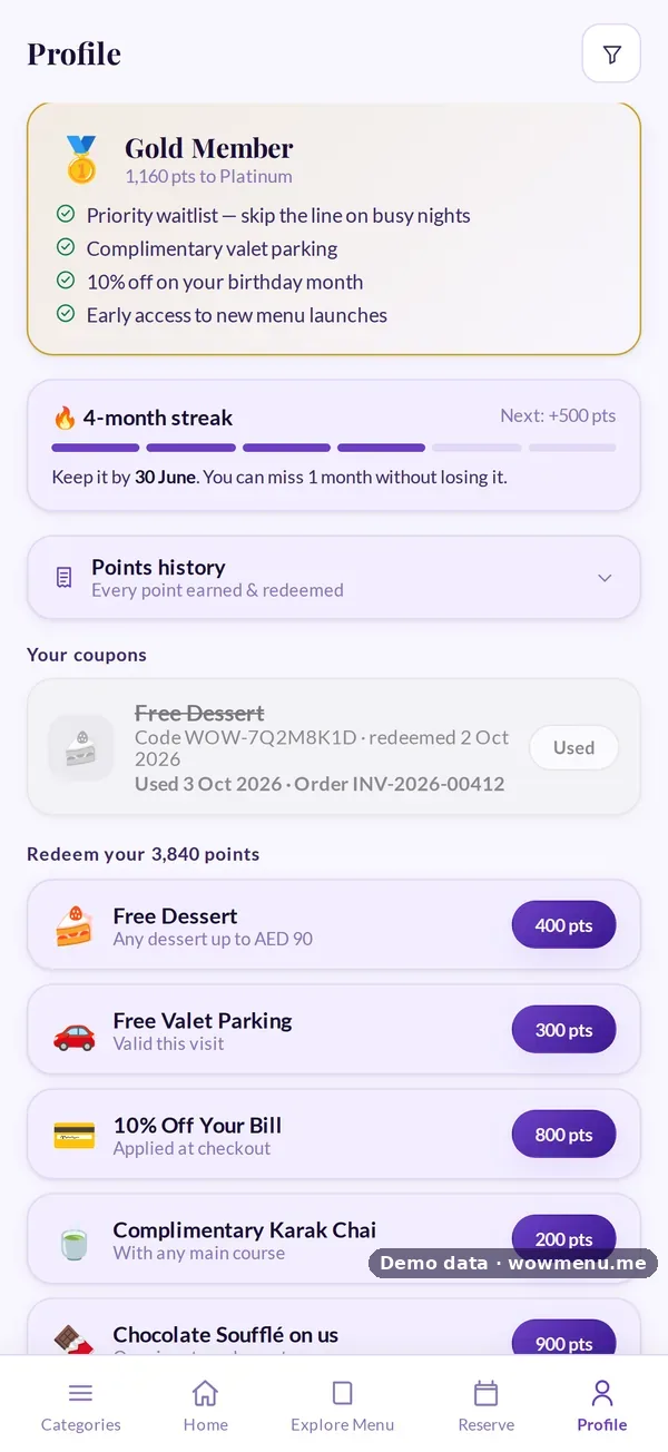
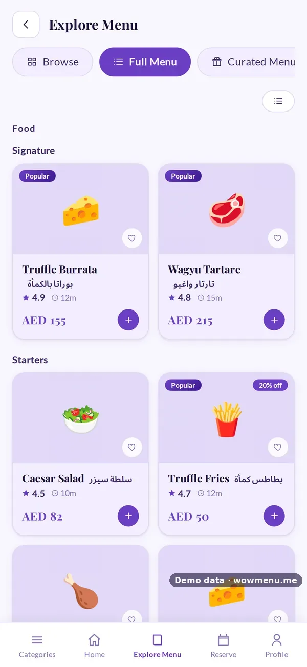
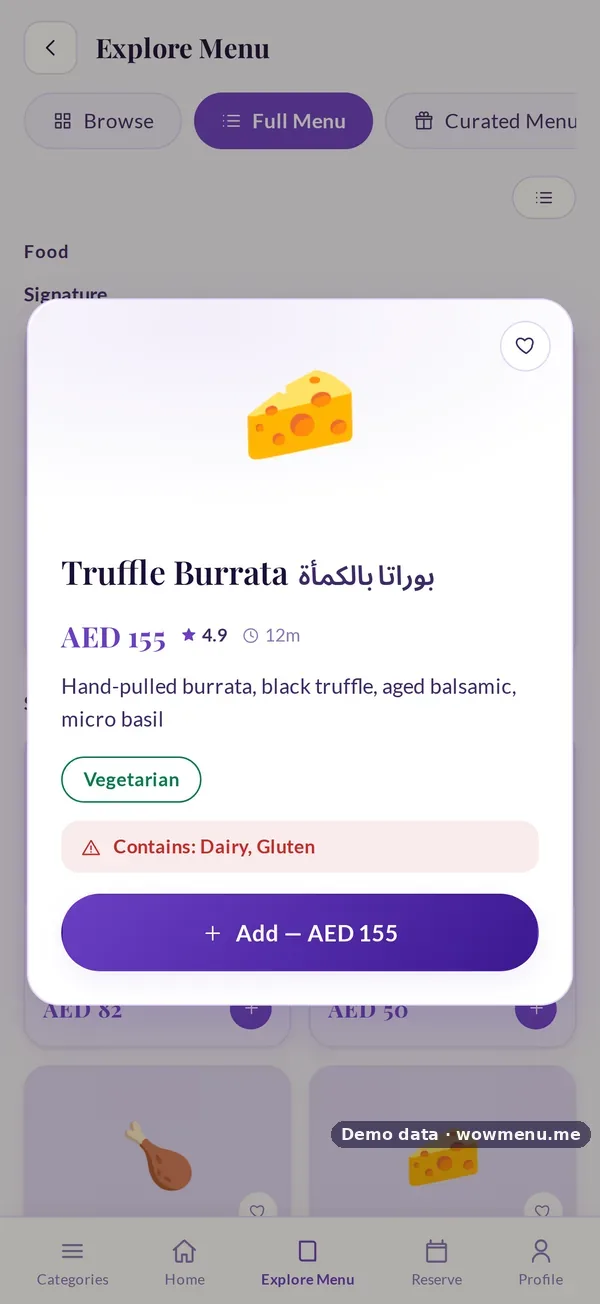
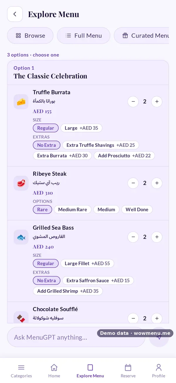
The first thing a guest sees of your restaurant may well be your digital menu, before the food and sometimes before a member of staff. If it looks like every other QR menu, it says nothing about you. Choosing its look is a brand decision.
Start from the room
Match the menu to the experience guests are about to have:
- Fine dining and evening venues: dark, quiet themes, such as Midnight, Obsidian or Noir Bistro
- Cafés and brunch spots: light, warm themes, such as Ivory Classic, Peach Blossom or Fresh Mint
- Seafood and beach venues: cool, fresh themes, such as Ocean, Clear Sky or Arctic
- Gulf and Middle Eastern restaurants: warm, rich themes, such as Desert Sand, Golden or Copper
WowMenu's library has 83 themes.
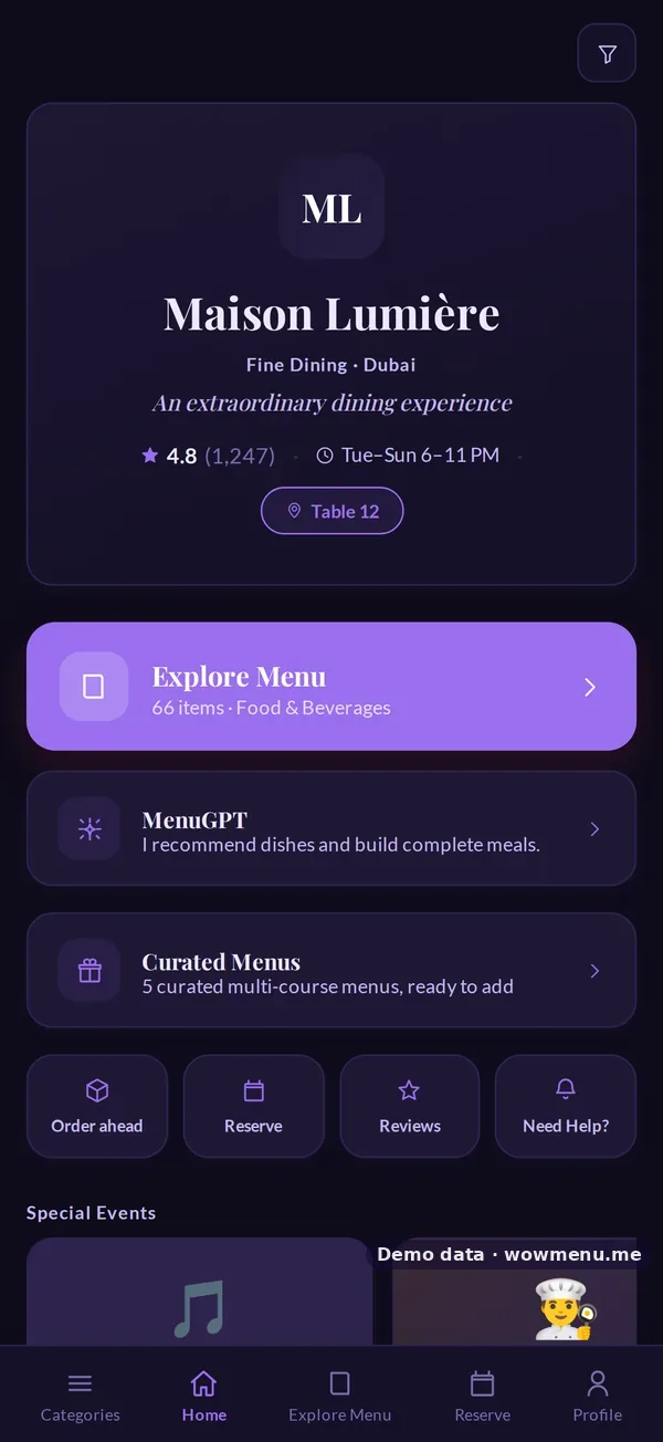
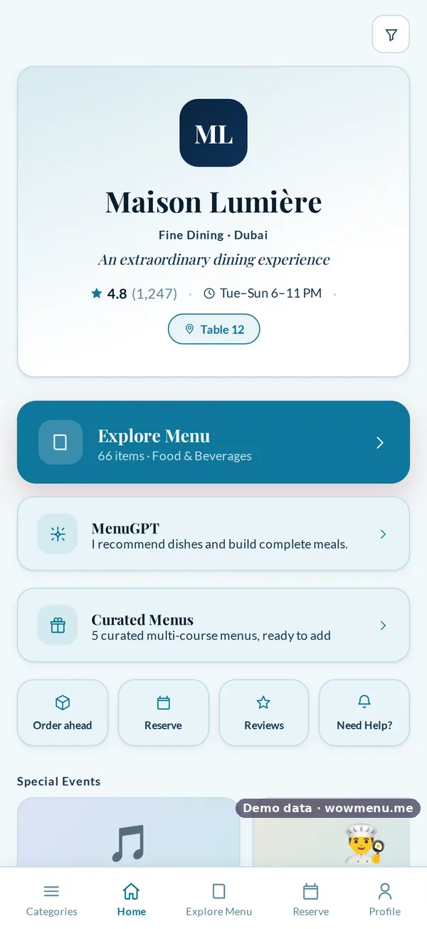
Approve what guests can switch to
Guests can switch theme in the menu's Settings, which helps someone reading in bright sunlight or a dark room. You decide which themes they can choose. Approve a few that fit your brand, and nothing outside that set appears.
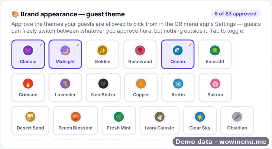
Make the landing page yours
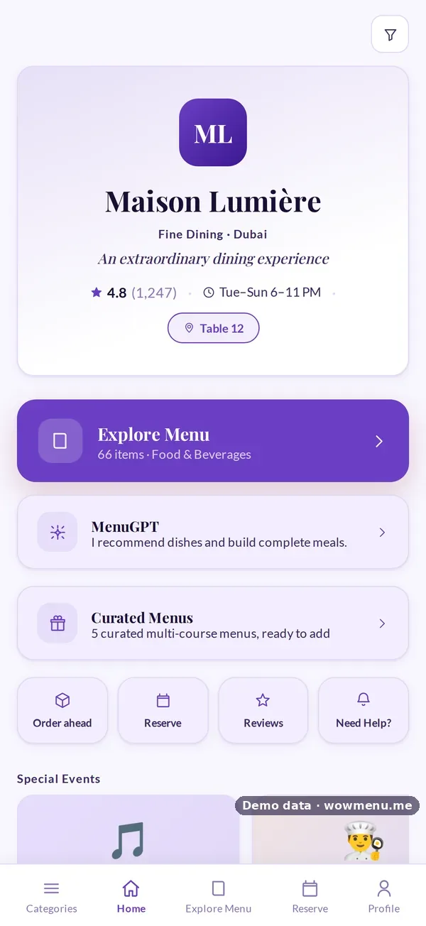
The first screen carries your logo, tagline, rating, hours and highlights such as special events. Treat it like your front door: one clear message, not ten.
Readability beats decoration
- Check contrast: light text on a pale background fails outdoors
- Keep photos consistent in style and lighting
- Test the menu on a real phone, at the table, at night
Consistency across branches
If you run several branches, use the same theme everywhere so guests recognise you, and vary the landing page highlights per branch.
See the theme library and the menu design template.